
My role
UIScanner is my product. I came up with it, designed it and built it, then launched it with Free and Pro plans, a store and releases for Mac and Windows.
What I owned
7The idea for a tool that checks any page, live or local, for one-off spacing, type, colours, radii and borders, and points to each one
Everything it does: page scans, whole-site audits, design systems from pages, tokens files or git repos, comparisons, CI checks and support for AI agents
The design, from the navigation, report and sitemap canvas to the scan box, both themes, motion and the icon
How the scanner decides what's inconsistent, including working out each page's own spacing system instead of assuming a 4px grid
Free and Pro, the pricing, and the Lemon Squeezy store
Releases for Mac and Windows, published as Nifty, with updates from inside the app
Testing on real sites and products, and fixing what that turned up
Every screen on this page is the real app. Halcyon, the site in most of them, is a demo site I made for the screenshots.
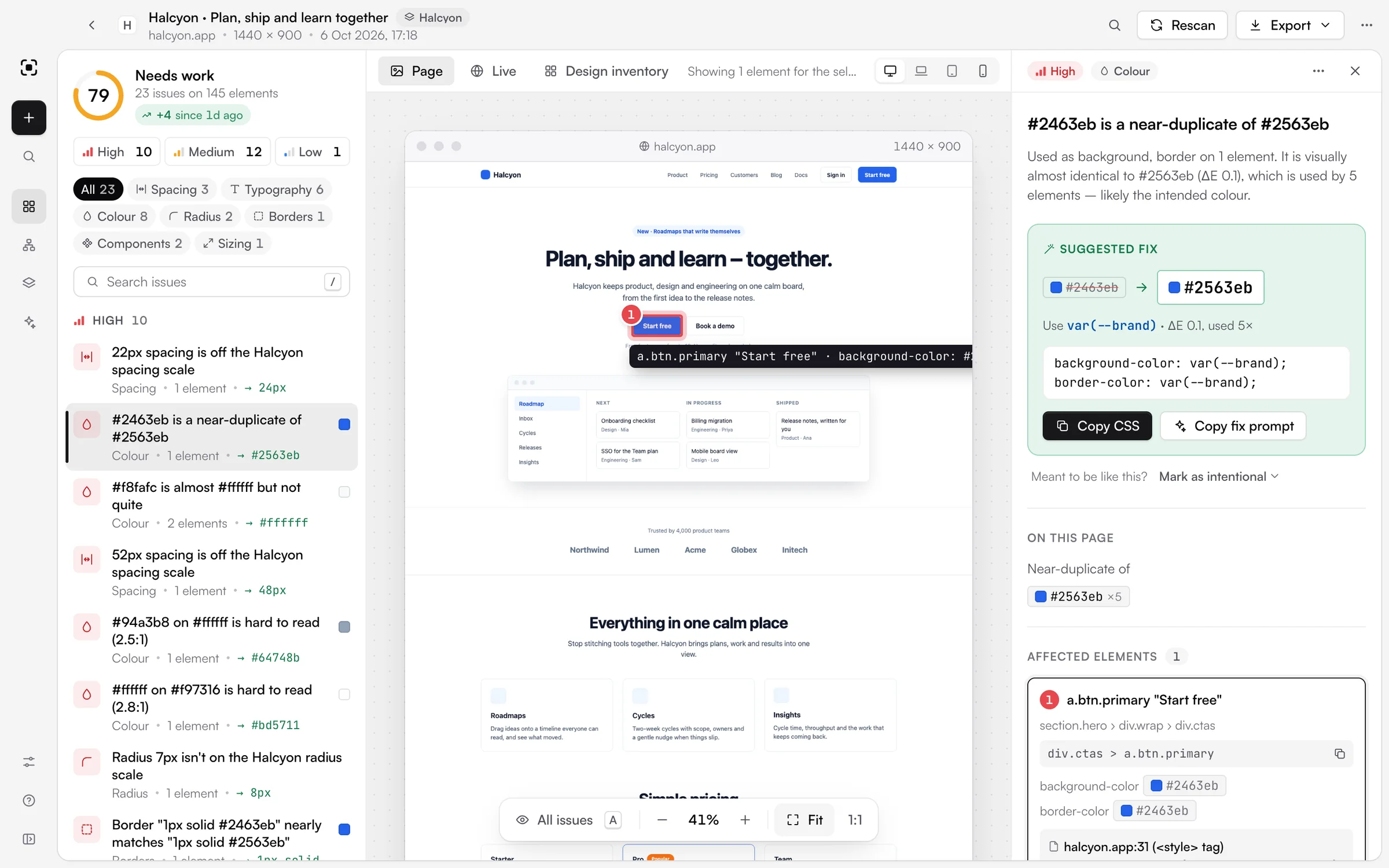
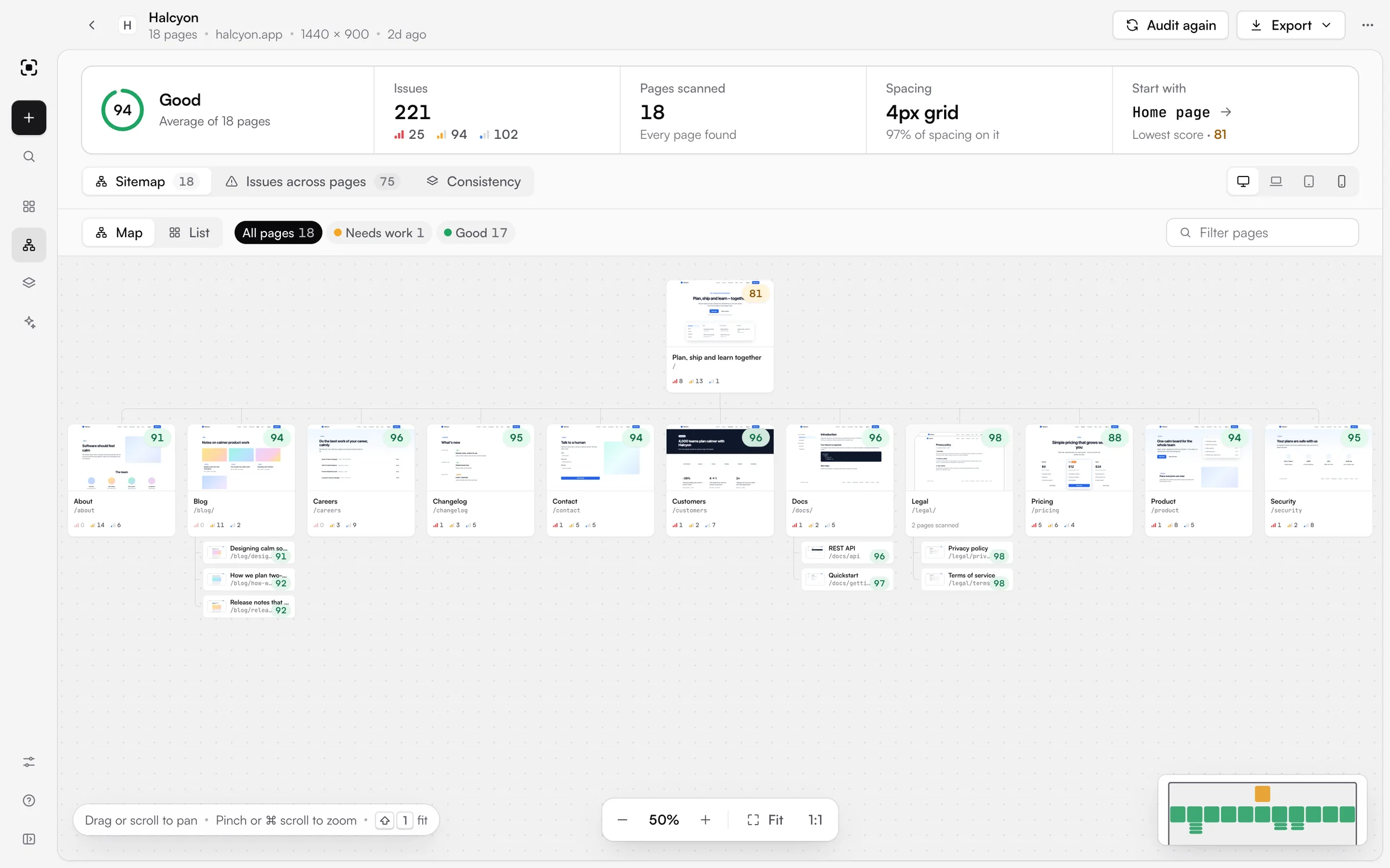
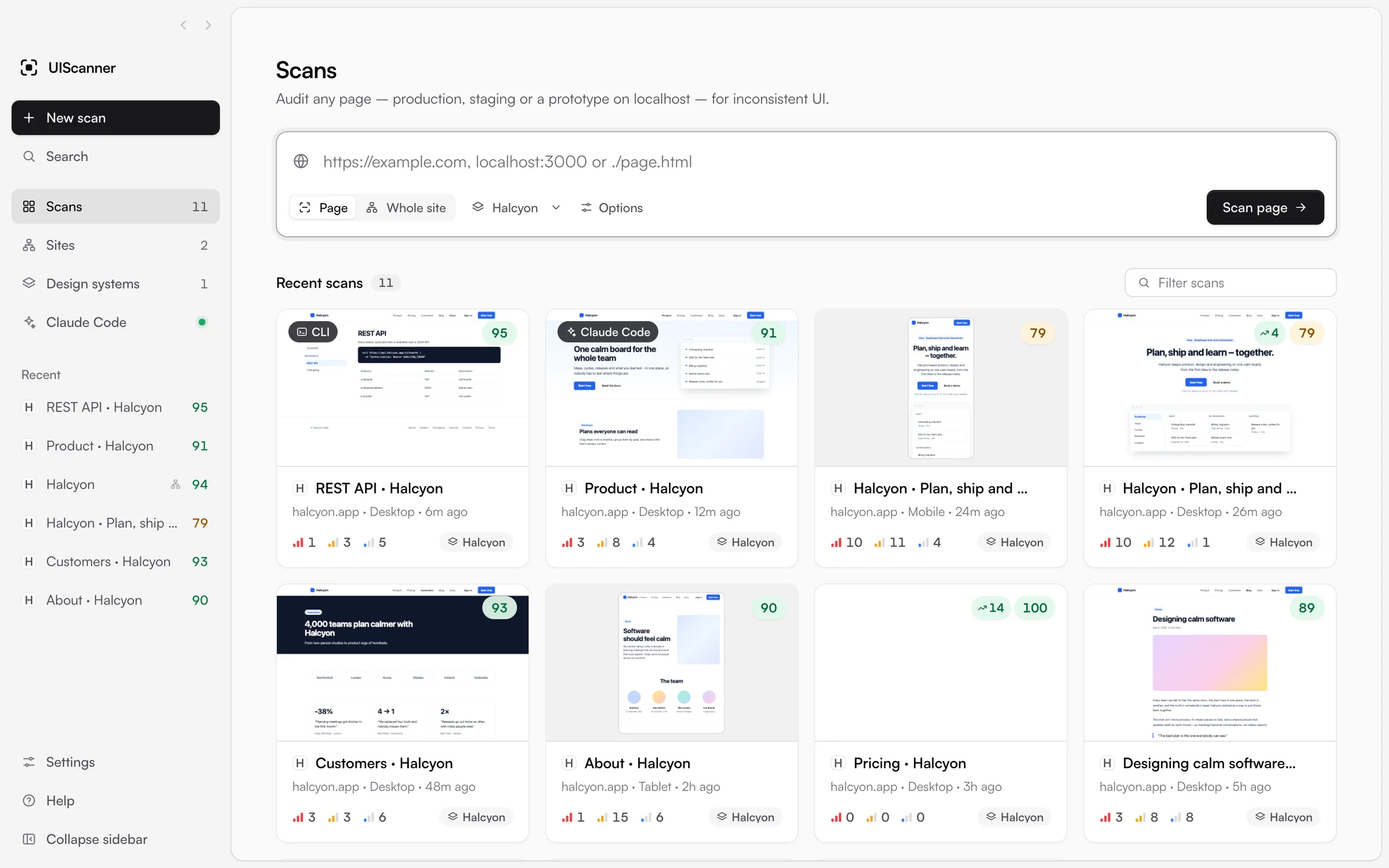
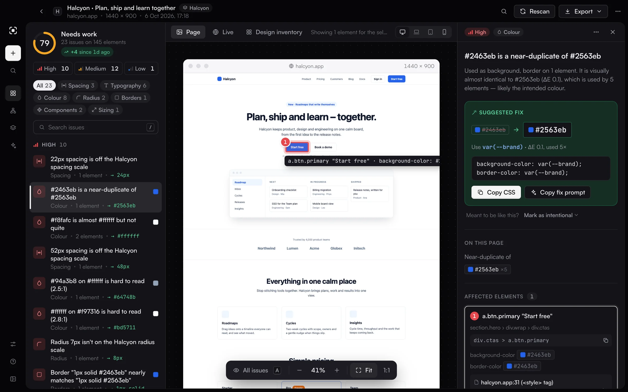
UIScanner 1.0.2: a page report with one issue selected, a whole-site audit on its sitemap, the scan history, and the report in dark mode.
The problem
Most inconsistent UI is small: a 22px gap where everything else uses 24, or a blue one shade off the brand blue. It's hard to see in a screenshot review, and finding it by hand means inspecting elements one at a time. AI agents add to it, because they build pages faster than anyone can check them.
I wanted a tool that looks at a rendered page the way a picky designer would, flags every value that doesn't fit with the rest, and shows exactly where it is. It had to work on a live site, a local dev server or a single HTML file, and AI coding agents had to be able to use it to check the prototypes they build.
Where it started
The first version ran in a browser. You pasted in an address and got a list of issues, each one outlined on a screenshot of the page. It found real problems straight away, and using it on real pages showed me what it needed next.
It needed to be a desktop app, with the live page inside it. It needed to cope with sites built on different rules, and the fix for each issue had to be impossible to miss. From then on I worked in short loops: change something, use it on a real page, and decide whether it was good enough.
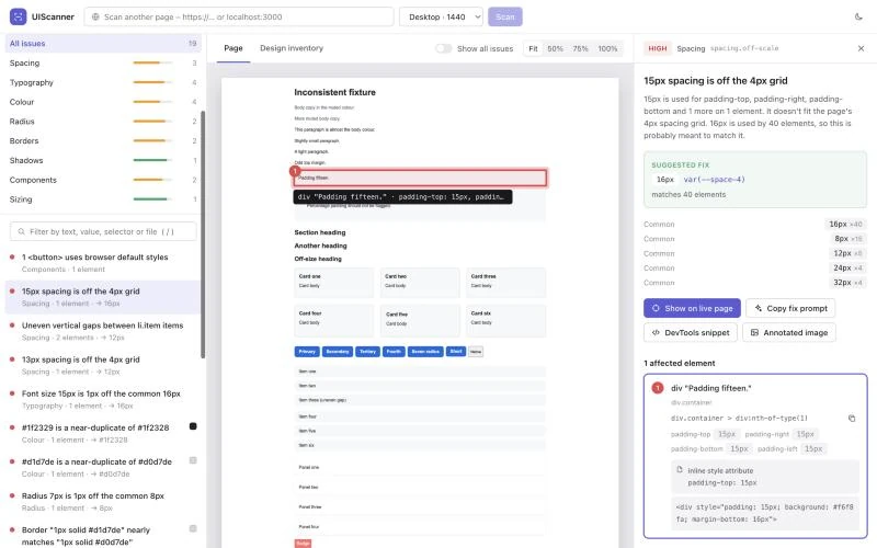
The first version: a report in the browser, with one issue outlined on a test page.
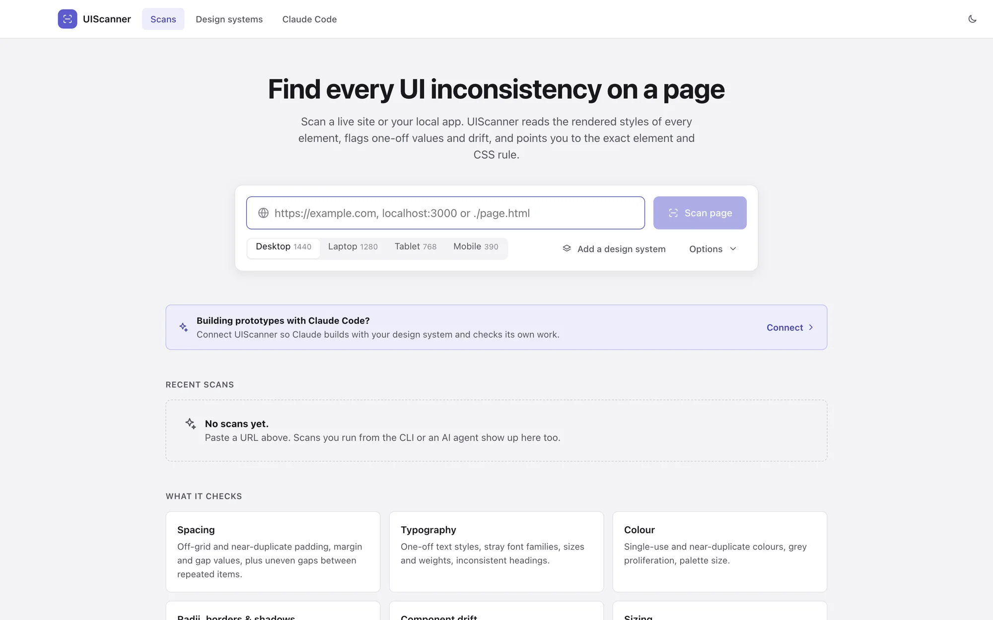
The first desktop build. It worked, but it didn't look like a tool yet.
Judging a page by its own rules
The first version judged spacing against fixed grids of 4, 5 and 8px. That falls apart for a team on a 6px grid, or one with a deliberate scale like 4, 6, 10, 14 and 20. Values get flagged all over the page, and people learn to ignore a tool that cries wolf.
So UIScanner works out each page's own system before judging anything. It looks for the coarsest grid that explains the page, from 4 to 12px, then for a short set of values the page sticks to. If neither fits, it says the page has no consistent system and only flags near-duplicates and one-offs. On four real product sites it found a 4px grid on one, an uneven scale on another, and no consistent system on the other two.
When a team has a design system, that becomes the rulebook instead. UIScanner can learn one from a few pages that get it right, import a tokens file, or read the tokens straight out of a git repo. Every report says which rules it used.
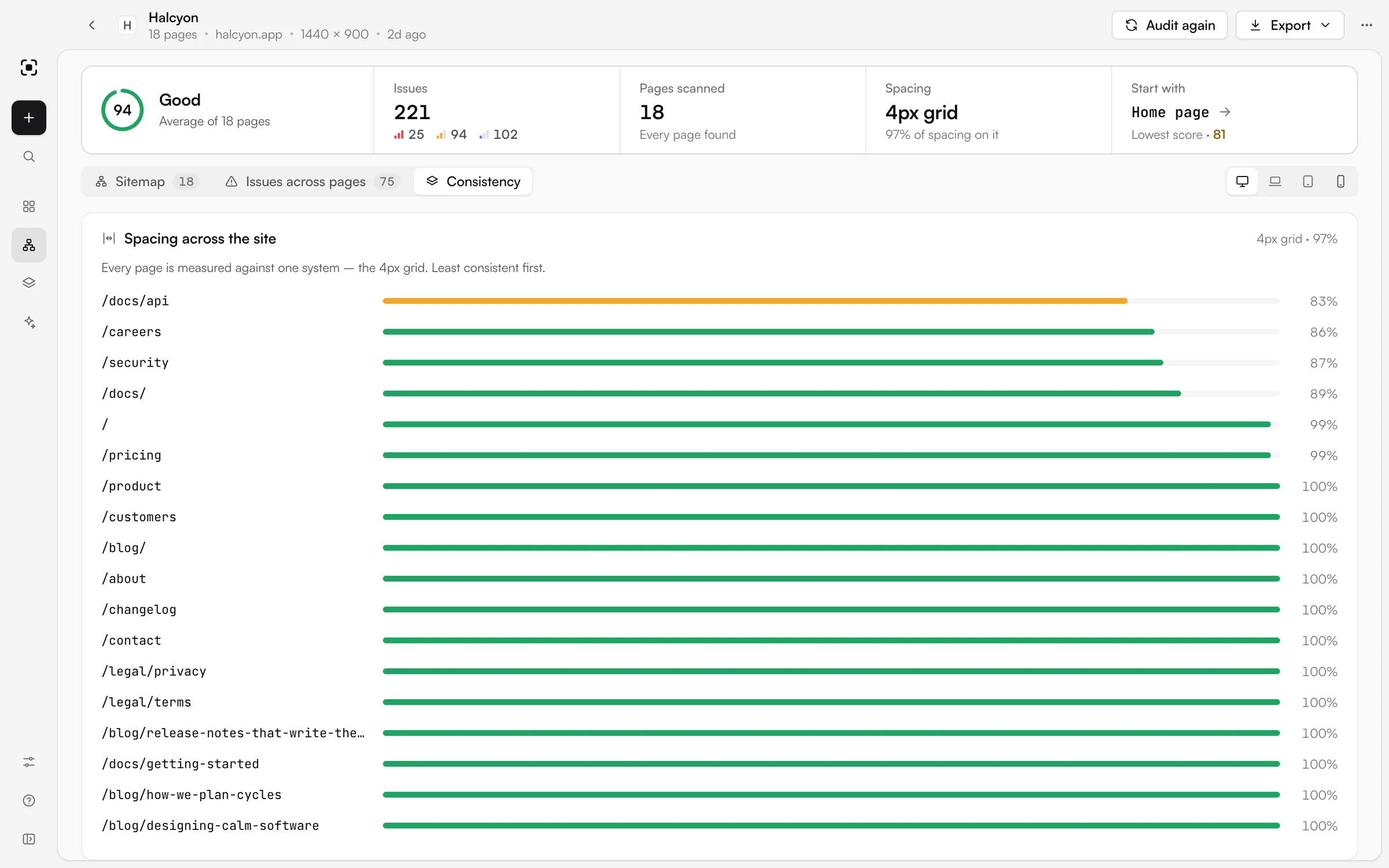
Every page in a site audit measured against the site's own spacing system, least consistent first.
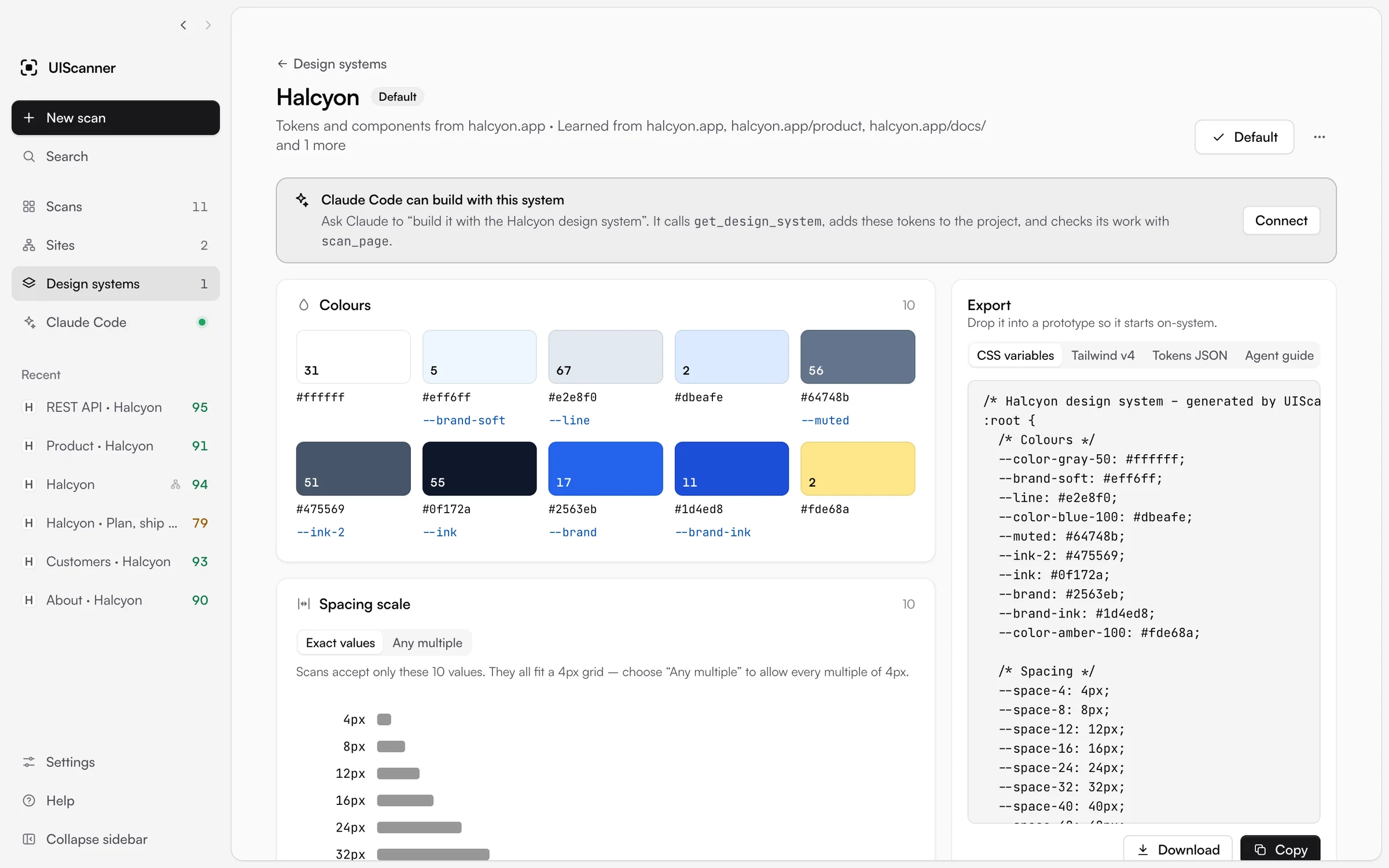
A design system learned from Halcyon's own pages, ready to export as CSS variables, a Tailwind theme or tokens.
Pointing at the exact element
Every issue points to where it is. Each one is numbered on a screenshot of the page, and selecting it outlines the element with its selector and the value that's off. The inspector shows the CSS rule the value came from, with its file and line, traced back to the original source file when the site has source maps.
In early versions the inspector was one long panel and the fix was easy to miss, so I split it into parts that each do one job. It now reads top to bottom: what's wrong, the fix in large type with paste-ready CSS and a prompt for an AI agent, how the value is used across the page, and the elements affected. If a value is deliberate, like a brand colour used once, you can mark it as intentional and it stops counting against the score.
The Live tab loads the real page inside the app and outlines the element there, so you can check it in context.
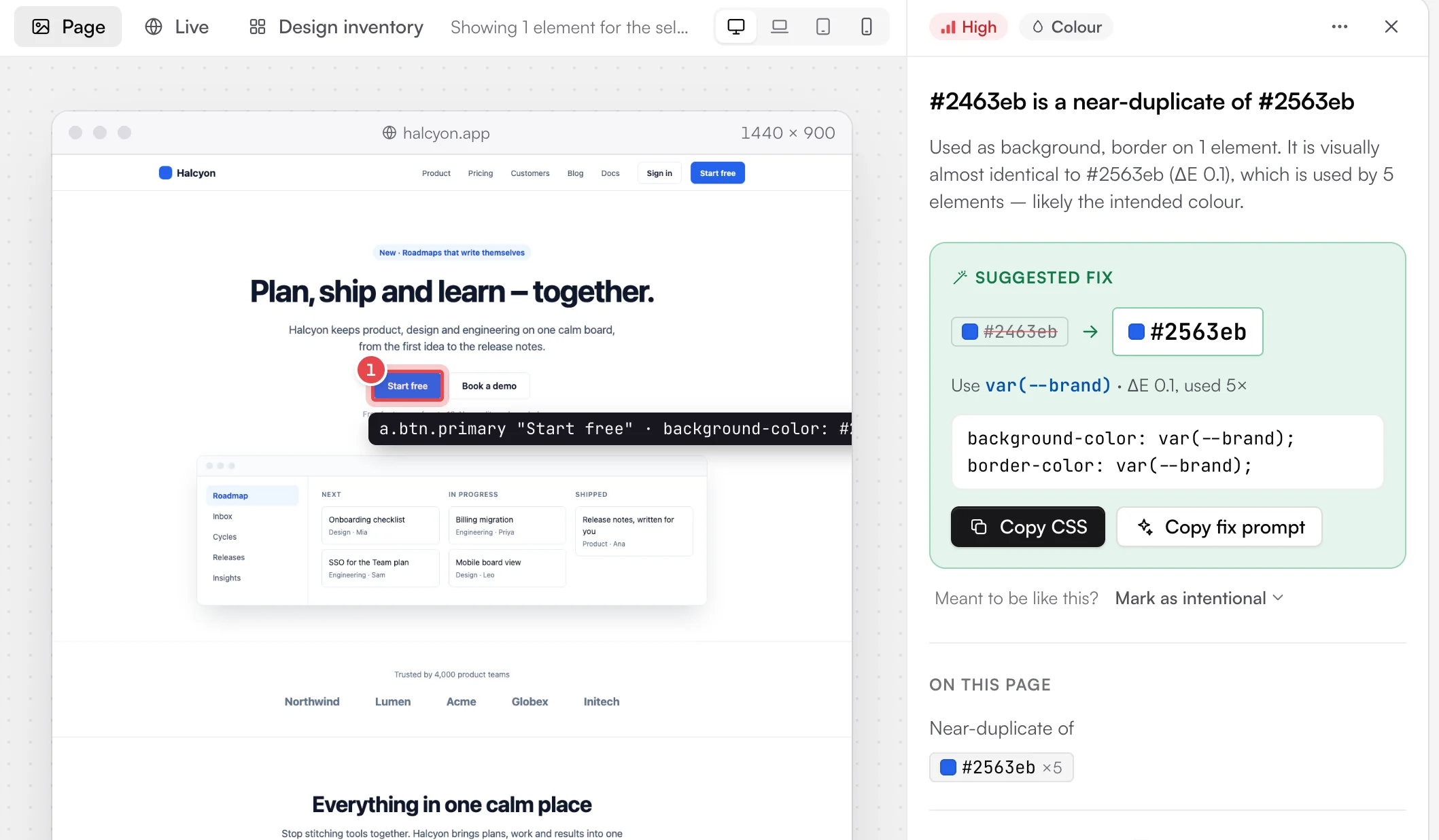
A button one shade off the brand blue. The fix names the token to use and gives the CSS to paste.
Making it look like a real tool
I wanted it to look like an industry-standard tool and be intuitive enough that anyone could pick it up. The first desktop build had a top bar like a website, so I moved the navigation into a sidebar. When you open a report, the sidebar folds into a rail of square icons and the page gets the room.
I kept the interface monochrome, with black buttons in light mode and white in dark, so colour only ever means something: severity and scores. Animation, built with Motion, makes panels and highlights move smoothly, and the type is Satoshi. Getting it to feel finished took a lot of small passes: an even rhythm in the sidebar, a getting-started card that didn't look like an afterthought, right-click menus, undo instead of confirm boxes, a native menu bar and a settings page. I even rebuilt the sidebar animation, because it juddered when a report opened.
The icon went through the same process. The first ones were violet with a glowing orange dot. I wanted something modern, clean, minimal and single-colour, and landed on a frame around a single element.
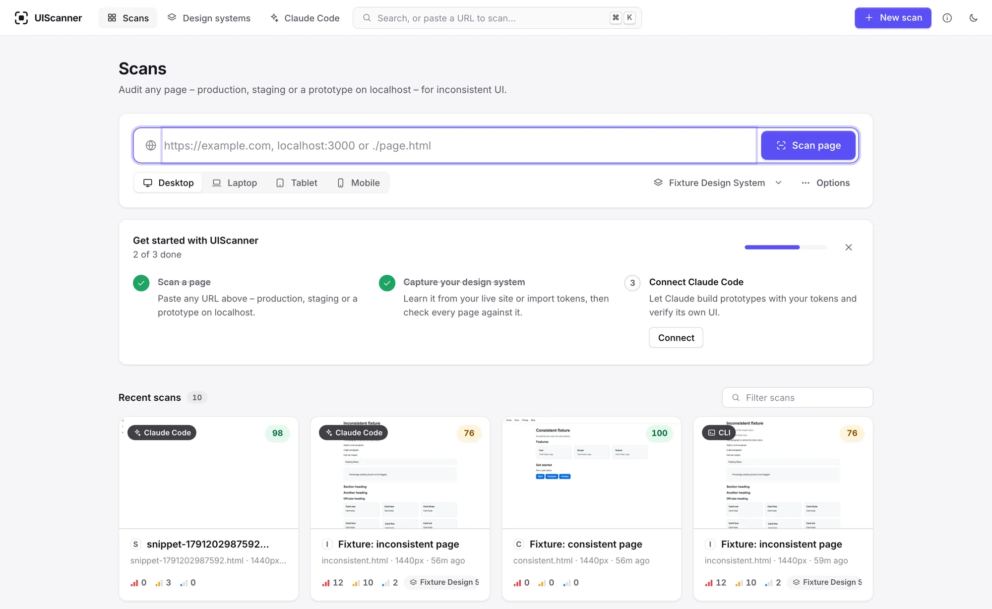
An early build with a top bar and violet buttons. It looked like a website.
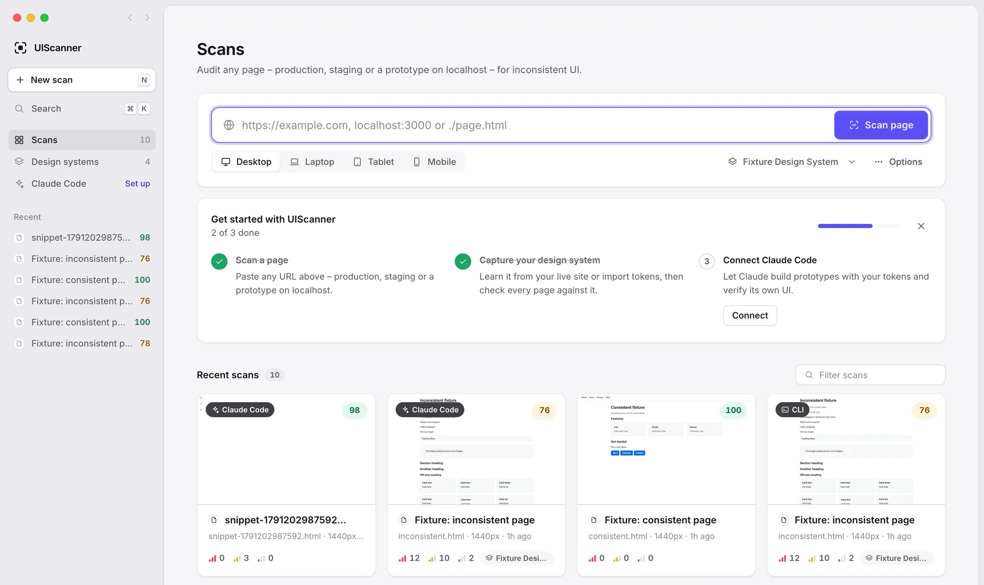
The sidebar came next. The violet went soon after.
Version 1.0.2: monochrome, set in Satoshi, with every scan shown as a preview.
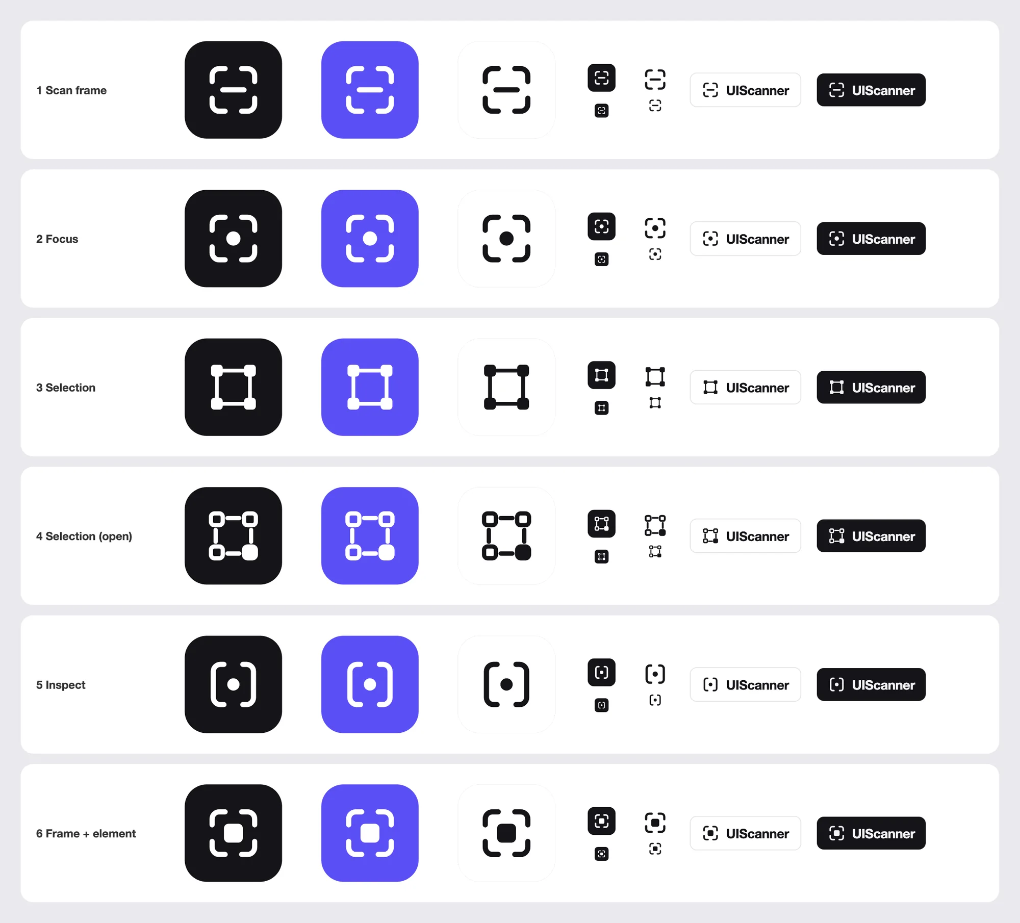
Single-colour icon options at the sizes the app uses. Number 6 became the icon.
From one page to a whole site
A page scan can't tell you whether a site holds together, so I added whole-site audits. Every page UIScanner finds goes on a sitemap with its score, so it's easy to see what to fix. It follows the site's links and sitemap, scans every page, and lays them out with the home page at the top, sections beneath it and child pages under those.
The first map wrapped sections onto new rows, which broke down on sites with a lot of top-level pages, so I turned it into an endless canvas that pans and zooms like Figma, with a minimap. Zoomed out, the scores stay readable and the cards tint by score, so the whole site reads as a heat map. Issues across pages groups the same problem on several pages into one fix, since it usually lives in a shared component or stylesheet.
Early versions asked how many pages to scan before starting, which nobody can know up front. Now it scans every page it finds, up to 200, and shows a running count.
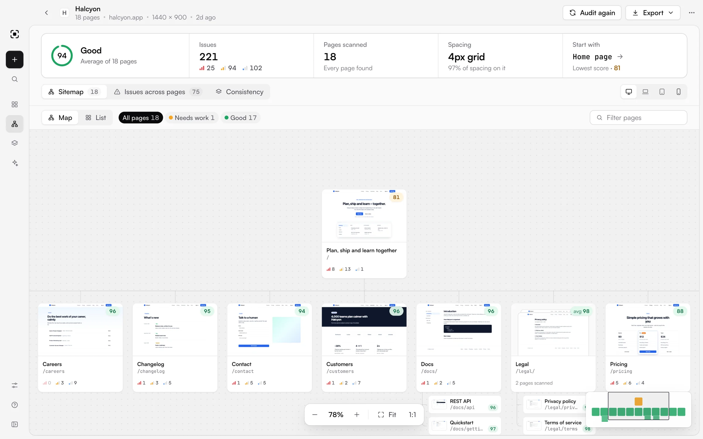
Halcyon's sitemap, zoomed in. The minimap in the corner shows where you are along the row.
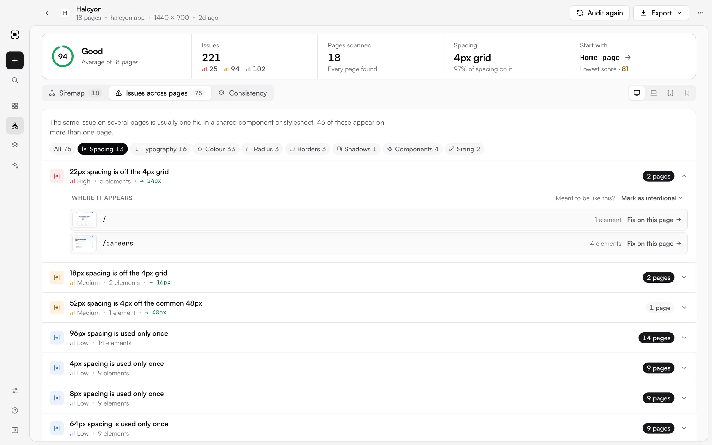
One spacing issue on two pages, with a link to fix it on each.
Scan once, switch devices
The scan box used to put everything up front: page or whole site with a hint beside it, the address, then desktop, laptop, tablet or mobile, a design system and options, over three rows. It wasn't intuitive, and the device was the wrong thing to ask for first. It should be something you change once you've seen the result.
Now the box is the address with one quiet row underneath, and the device switch lives on the result. Every report and site audit has one above the page. A size you've already scanned swaps in straight away, and one you haven't is scanned with the same settings while the report stays on screen.
Testing on a real dashboard turned up another problem: a report saying "1 element is below captured area", which nobody can work with. Some apps scroll inside a panel instead of the page, so the screenshot only caught the first screen. Scans now let those panels out to their full height before capturing, and anything that's off screen on the live page too, like a card past the end of a carousel, gets an arrow pointing to where it is.
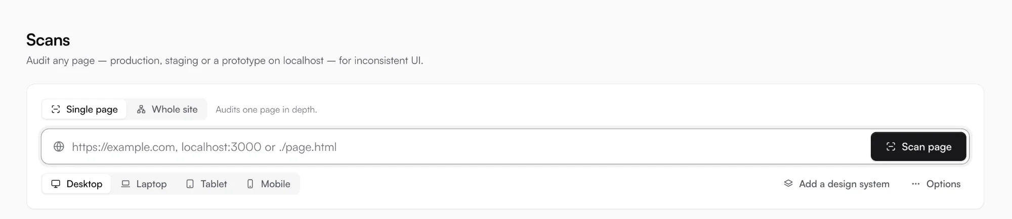
Before: three rows, with the device picked up front.

After: the address, and one row underneath.
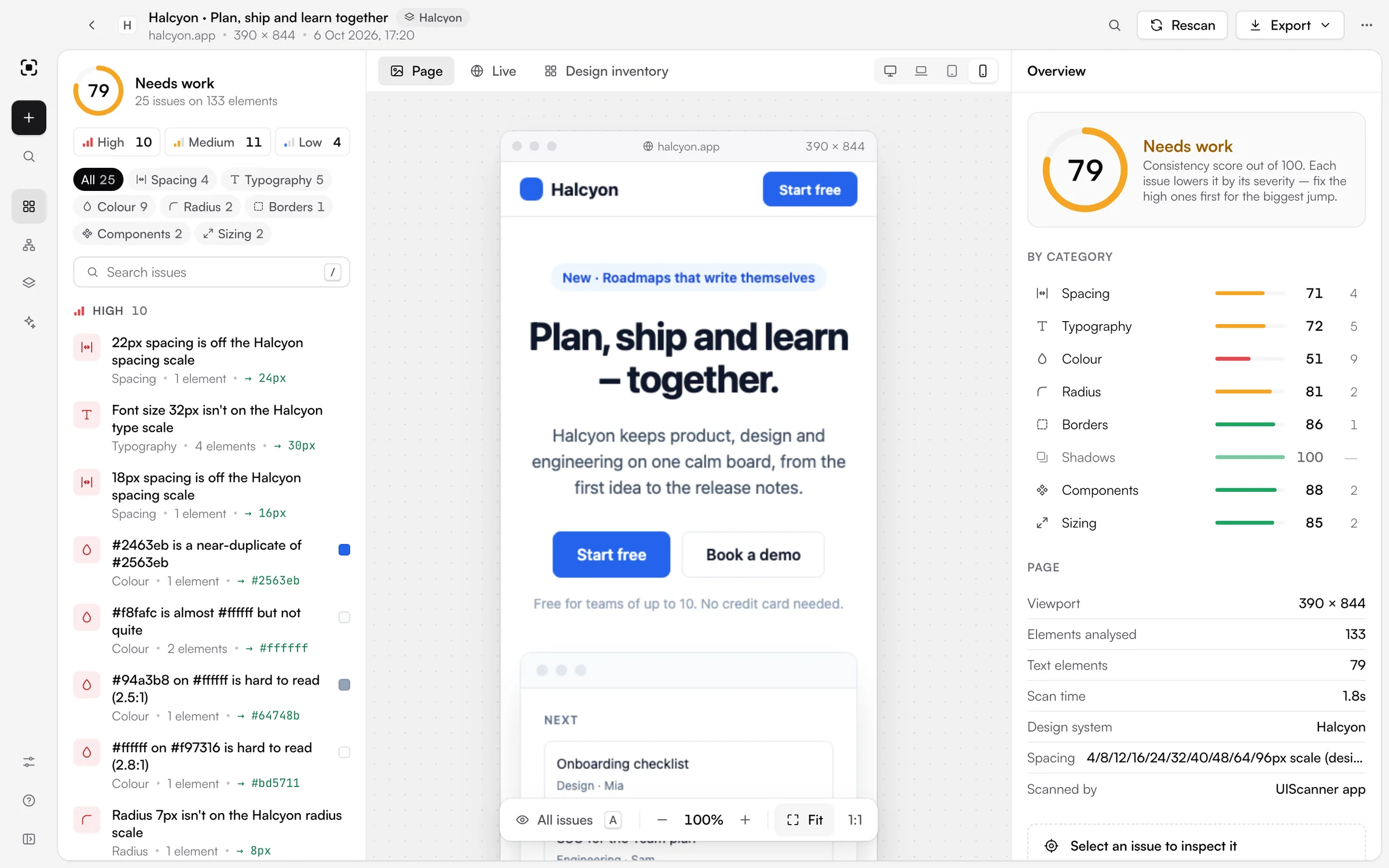
The same report on mobile, one click from the desktop scan.
Checking what AI agents build
I wanted AI coding agents to check their own work with UIScanner while they build prototypes. It runs an MCP server, the standard way agents like Claude Code connect to tools, with 14 tools. An agent can fetch a design system as CSS variables or a Tailwind theme before it starts, scan what it built, read each issue's selector and the CSS line behind it, look at a screenshot of the problem, and compare before and after to show a fix worked.
One button connects UIScanner to Claude Code, and another adds it to a prototype's repo with a skill that walks the agent through building, scanning, fixing and checking. Scans an agent runs show up in the app with a label, and a command line tool lets a team fail a pull request that adds new issues.
Testing it from a real project showed that agents only load their tools when a session starts, so after connecting, the app now tells you to open a new session.
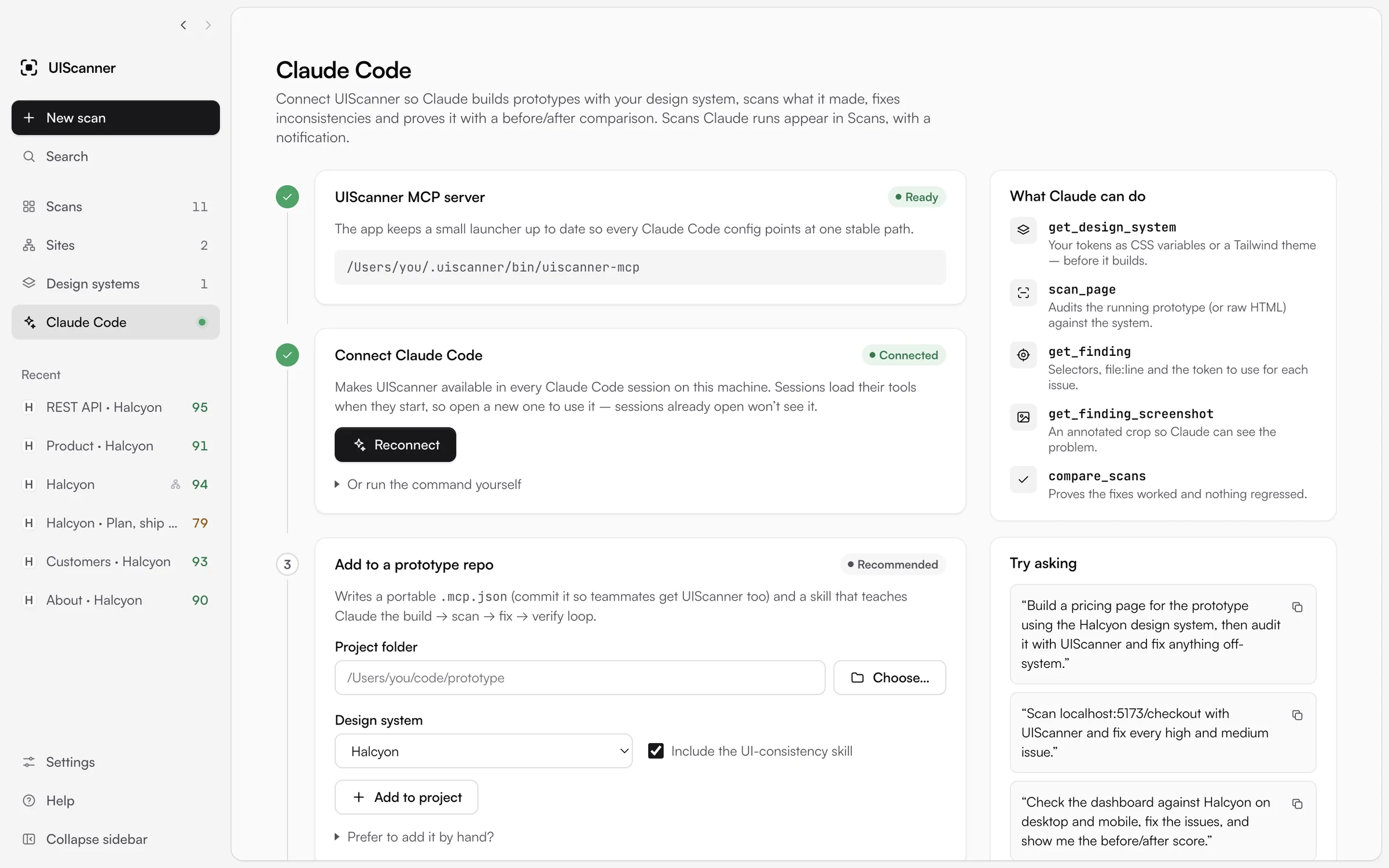
Connect once, add it to a prototype repo, or copy a prompt to try.
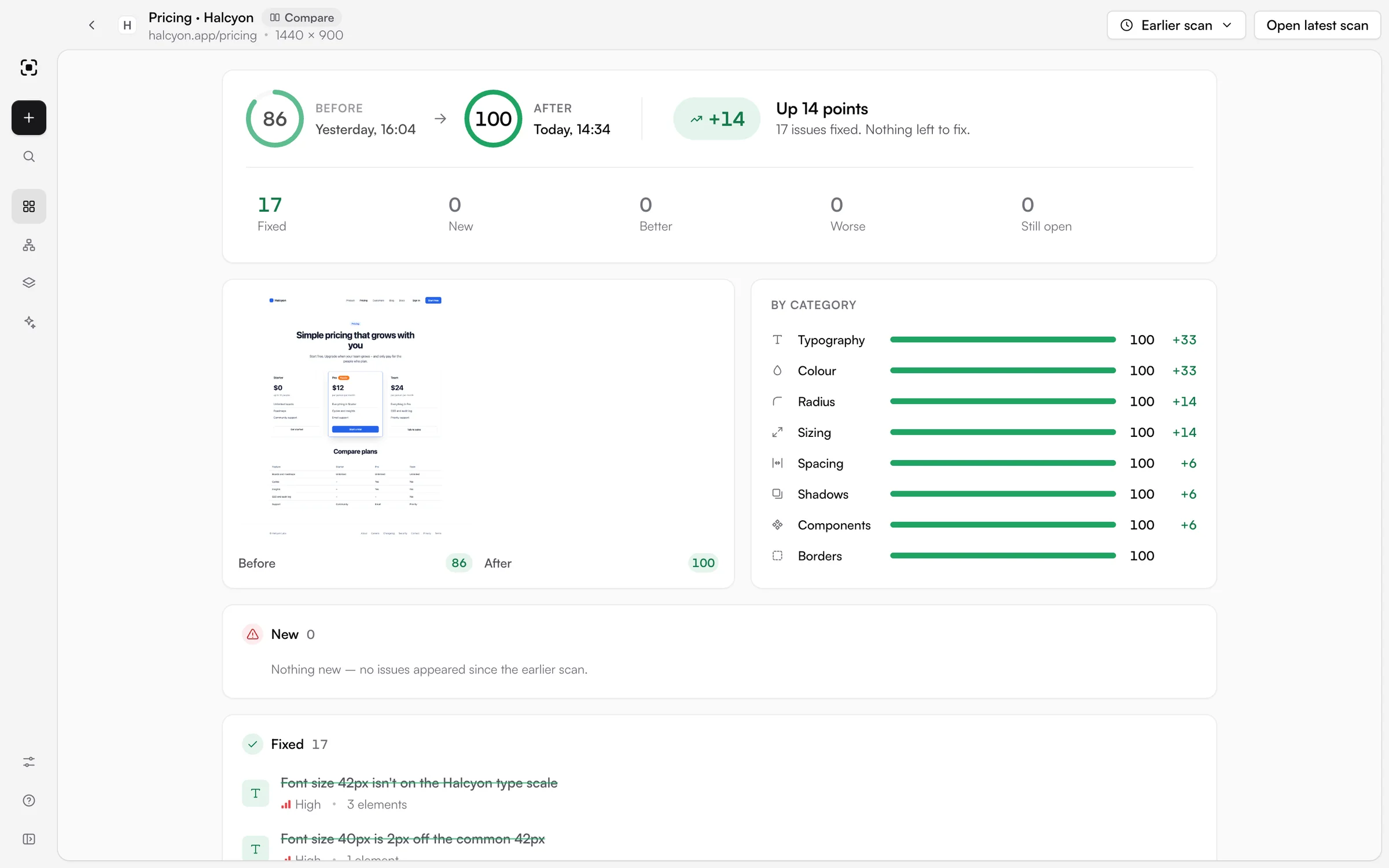
Before and after on the pricing page. Agents run the same comparison to check their fixes.
Selling it
I wanted UIScanner to be good enough to sell, with a free mode and a paid one. Whole-site audits and shareable HTML reports are Pro, and everything else is free: single-page scans, design systems, Claude Code, comparisons and CI. Pro is $49.99, once, for up to three computers, and every install starts with a 14-day Pro trial.
I set up the store on Lemon Squeezy, which handles checkout and issues the licence keys. The app checks keys against Lemon Squeezy's public licence API, so there's no secret key inside it for anyone to find. I also made the nine images for the store listing from a demo site, with a script that rebuilds them whenever the UI changes.
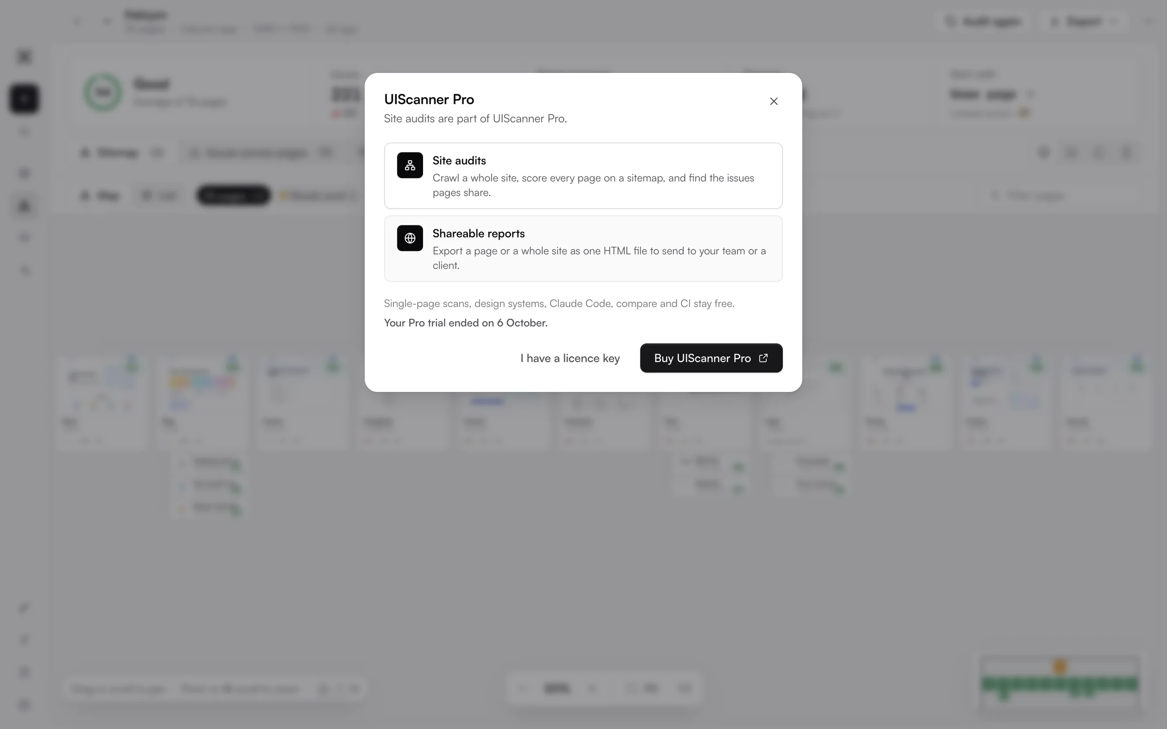
On Free, auditing a site again opens this instead.
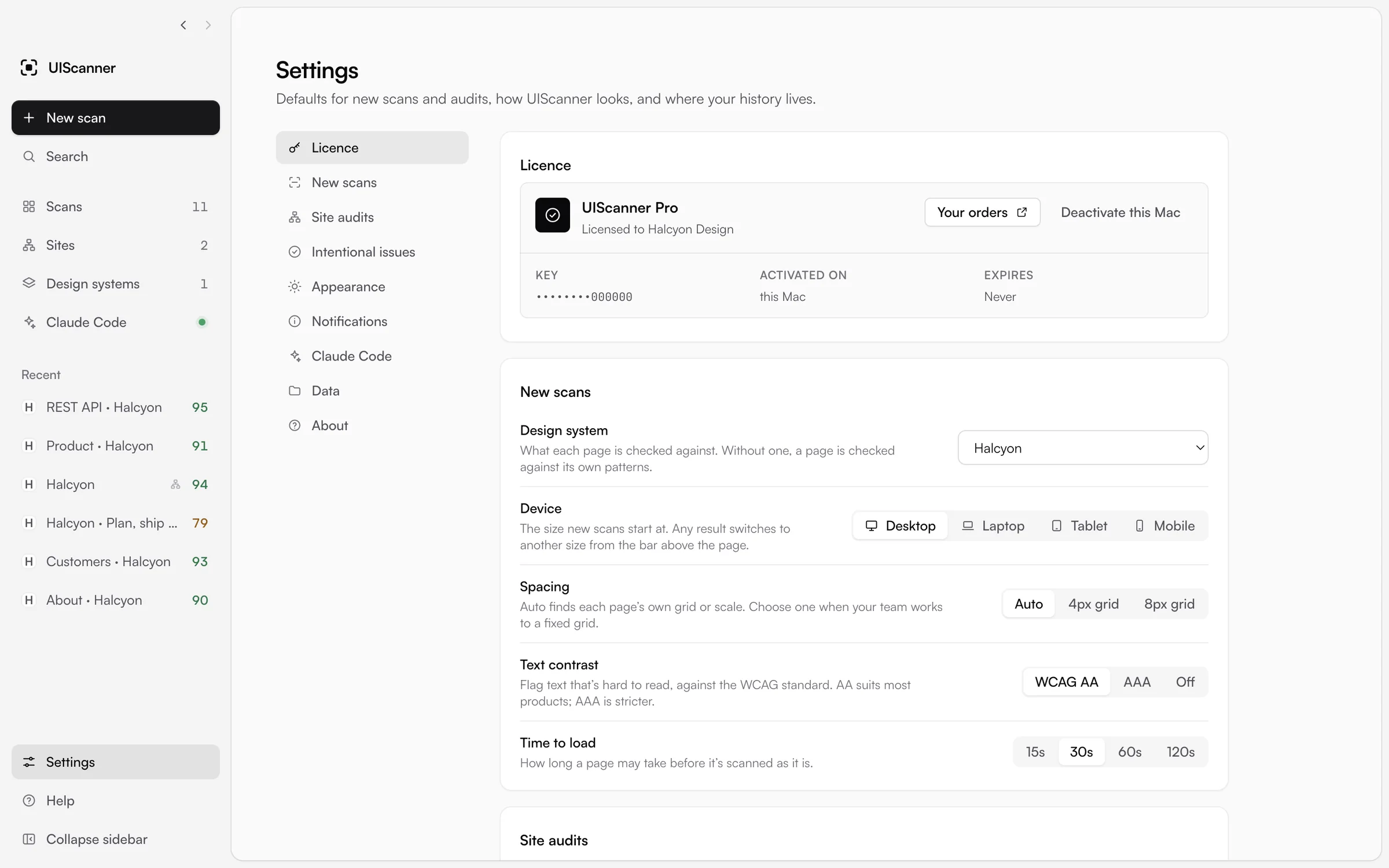
An active licence in Settings, with the computer it's on.
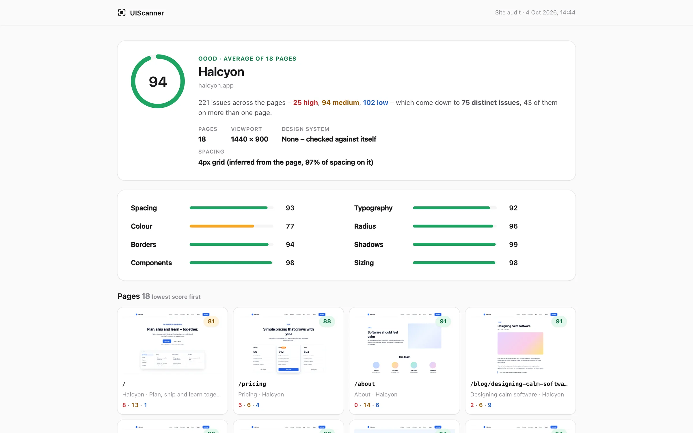
A shareable report: a whole site audit as one HTML file that works offline.
Shipping updates
When a new version is out, an "Update available" row appears in the sidebar. One click downloads it, checks it against the release's hash, swaps it in and restarts on a What's new note. It won't restart in the middle of a scan, and it warns you first if an agent is using the app. Releases are published on GitHub, and putting one out takes three steps: bump the version, write what's new in the changelog, and run one command.
The Mac app runs on Apple silicon and Intel, and there's a Windows installer that needs no admin rights. Both name Nifty as the publisher. Neither is code-signed yet, so macOS and Windows both warn people the first time they open it.
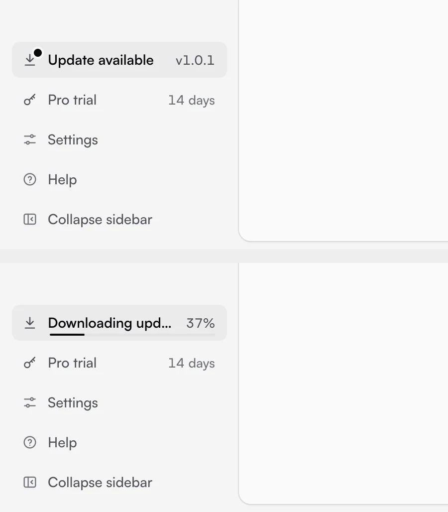
The update row in the sidebar, offered and then downloading.
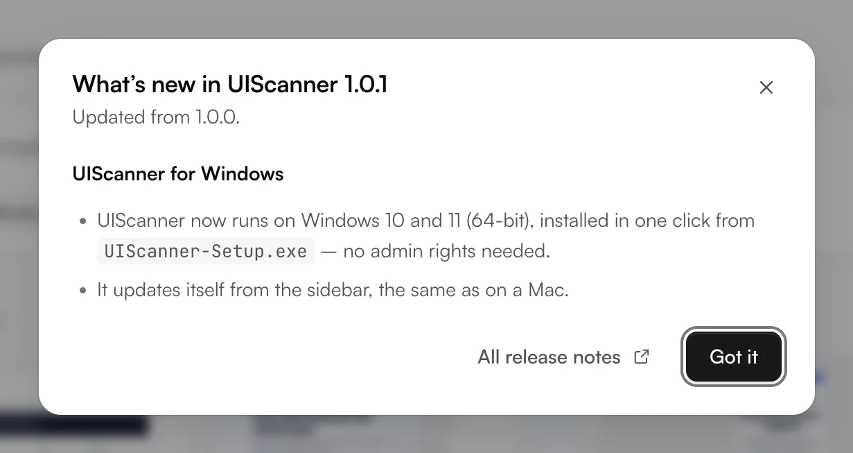
What's new after restarting, taken from the changelog.
Results
- UIScanner 1.0.2 is out for Mac and Windows.
- UIScanner Pro is on sale through Lemon Squeezy at $49.99.
- Mac copies update themselves from the sidebar, from public GitHub Releases.
- It works three ways: as a desktop app, a command line tool, and an MCP server with 14 tools for AI agents.