
My role
I lead design on Acquia Source. I designed the navigation every Acquia product sits in, then built the coded prototype the whole team designs, reviews and demos in, with guardrails that steer everyone's contributions, AI-written or not, onto the design system. I designed the platform, not every product in it: colleagues own the products inside it, like security and asset management, and build them in the same prototype.
What I owned
6The information architecture and navigation shell for desktop, tablet and mobile, with the interaction notes engineering builds from
The prototype itself. I set it up in July 2026 and wrote most of its 900-plus commits, by prompting Replit's agent and later Claude Code
Rebuilding its pages on GEL, Acquia's design system, so engineering can take code straight from them (35 so far)
The guardrails that let other people contribute: design rules, lint rules, designer tools and CI checks
Reviewing and merging colleagues' pull requests
Leading the two designers who work under me
What I shared
3A library of 24 UI patterns. I turned the R&D design team's written guidance into working examples that new screens copy
Unified user management, which I've worked on with two colleagues
Feature areas where colleagues build their designs on my foundations and I review them
What others did
3Security and CDN rules, the asset management apps, and site deployment flows, each built by the person who owns that area
Parts of the Acquia AI chat and agent access, built by colleagues on top of my designs
GEL itself, which belongs to Acquia's design system team
Every screen on this page is from the prototype, which has the full design. Acquia Source used to be called Command Center, which is the name on my CV.
 (opens full size in a new tab)
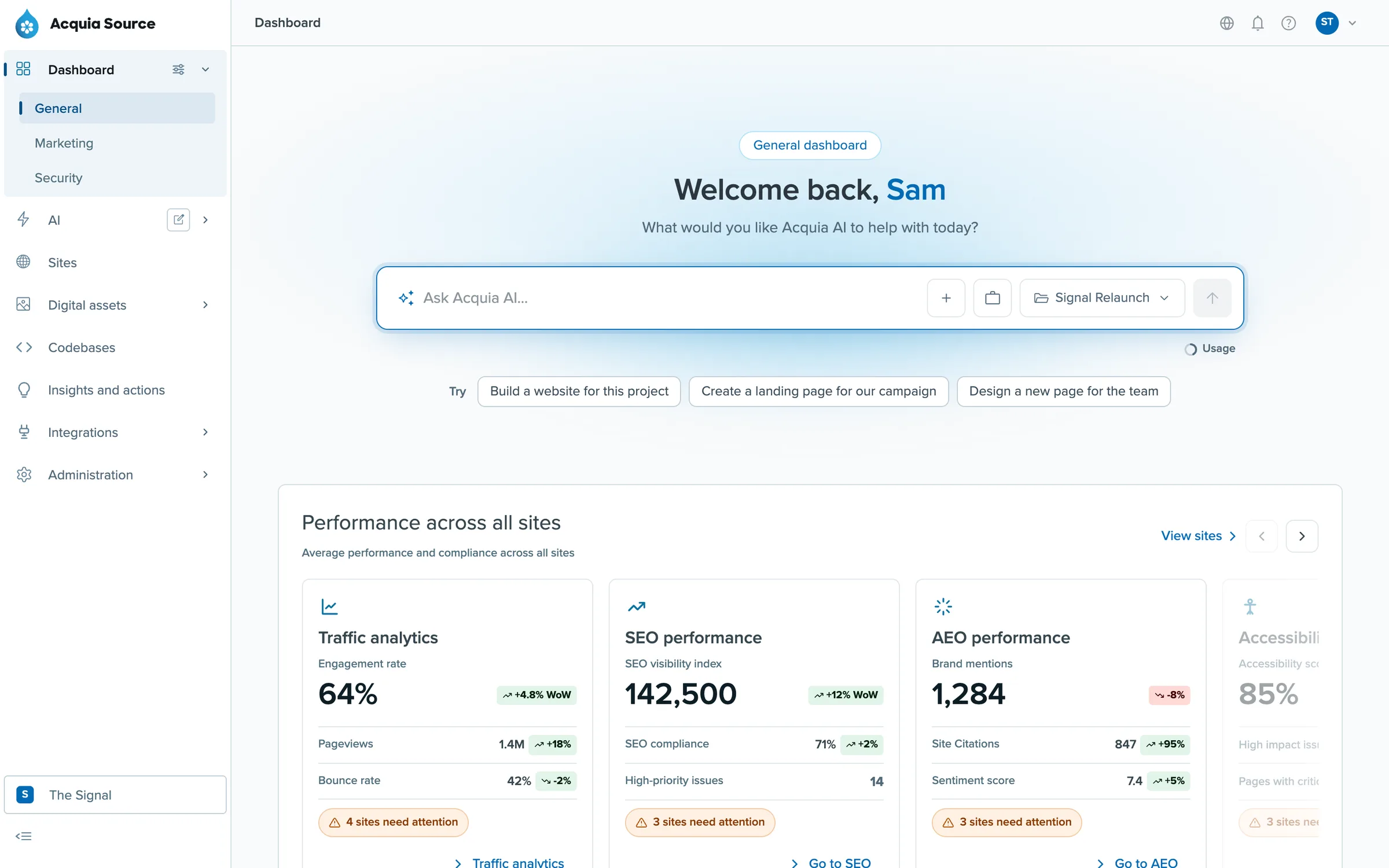
The Source dashboard in the prototype. Acquia AI sits at the top of the page, above performance across every site.
The problem
Acquia grew by building and buying products: Cloud Platform for hosting, Drupal CMS and Canvas for building sites, a DAM for assets, Web Governance, and more. Each one came with its own interface, its own navigation and its own way of managing people. A customer running a few sites could bounce between several of them in a day, relearning where things live every time.
Acquia wants to compete as a digital experience platform, and that's a hard sell when the experience is split across half a dozen products. Source is one platform with one navigation and one way of doing the common jobs, with Acquia AI working across all of it.
Where it started
The first version was called Command Center. From January 2026 I designed it as the lead designer, testing whether one shell could hold sites, insights, assets and AI. It had an AI panel docked on the left that could build a site from a prompt, which is where a lot of the Acquia AI thinking began.
I also worked with engineering on the technical approach for bringing existing products into the new shell, since rebuilding all of them at once was never an option.
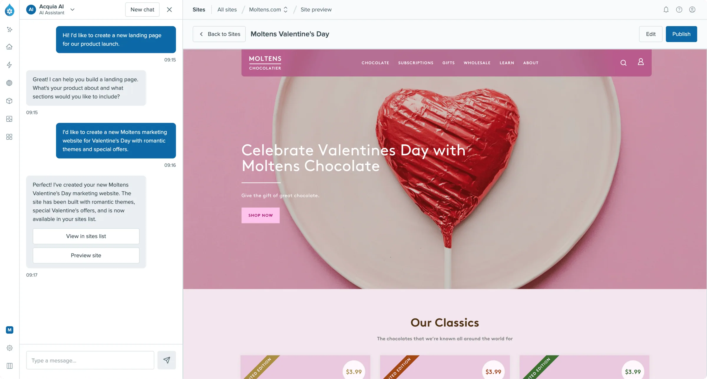
Command Center's AI panel building a landing page from a prompt.
One navigation for every product
The navigation had one job: stop customers noticing that Source is several products. I organised it by what people do (sites, AI, digital assets, codebases) rather than by whichever product powers each area. Every state is in Figma with a note for engineering explaining how it behaves, and the screens below are the real thing, running in the prototype.
Hovering a section you're not in opens its sub-menu as a pop-out, so you can jump straight to a page. The section you're in shows its sub-menu as a nested list instead. Sections with no sub-menu show a tooltip, which matters most when the nav is collapsed to icons.
On tablet the nav starts collapsed and opens over the page, so the content isn't squashed. On mobile it moves into a menu button in the top bar, with sections as accordions. Because a section becomes an accordion there, each sub-menu's first link goes to that section's landing page, otherwise you couldn't get to it.
The organisation switcher lives at the bottom of the nav, for agencies and groups that run several brands from one account.
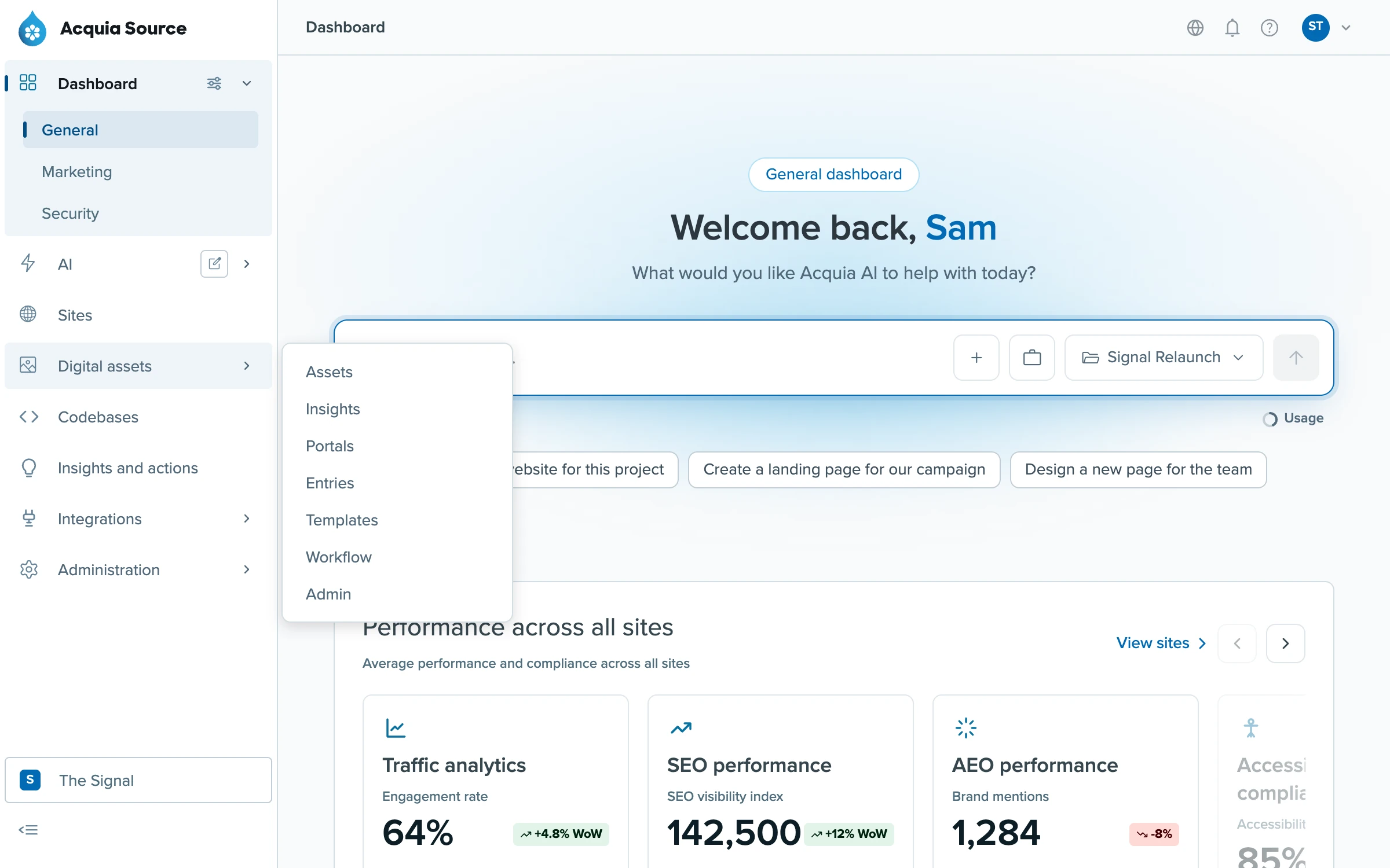
The section you're in opens as a nested list. Hovering another, here Digital assets, pops its sub-menu out so you can jump straight to a page.
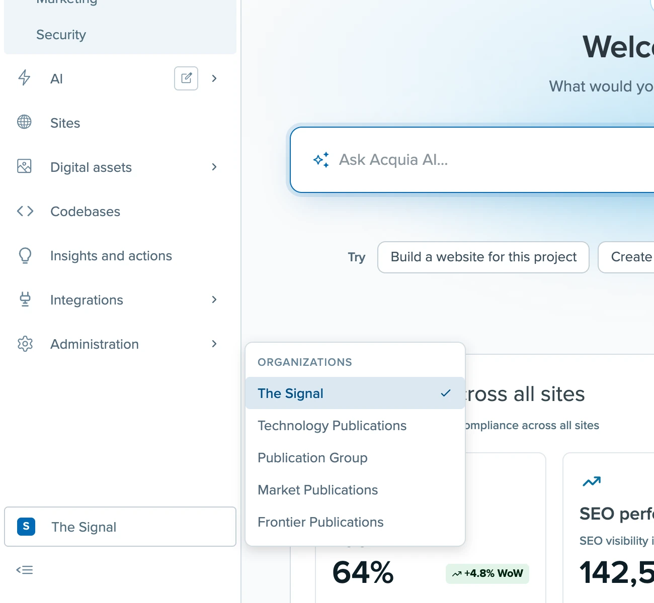
Switching organisation from the foot of the nav, without leaving the page.
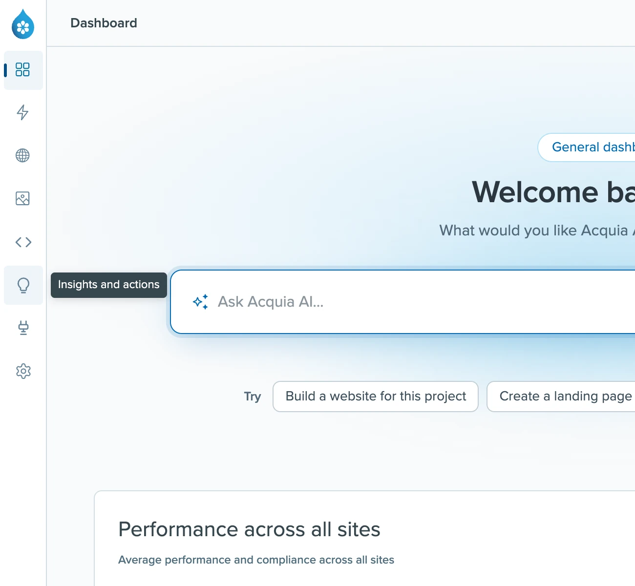
Collapsed to icons, with a tooltip for sections that have no sub-menu.
A prototype everyone can build in
By the summer, Figma couldn't keep up. Source had to cover dozens of areas, several designers were working on it at once, and product and engineering needed to click through the real thing rather than a stack of frames. In July 2026 I started a coded prototype from an export of our earlier Figma prototypes and made it the reference for the whole platform.
It now has 104 routes: dashboards, sites, digital assets, codebases, insights, security, integrations, administration and Acquia AI. Everything runs on one set of sample data, a fictional media group called Signal, so a site you see on the dashboard is the same site the AI talks about and the same one in the sites list. It's what the product team demos.
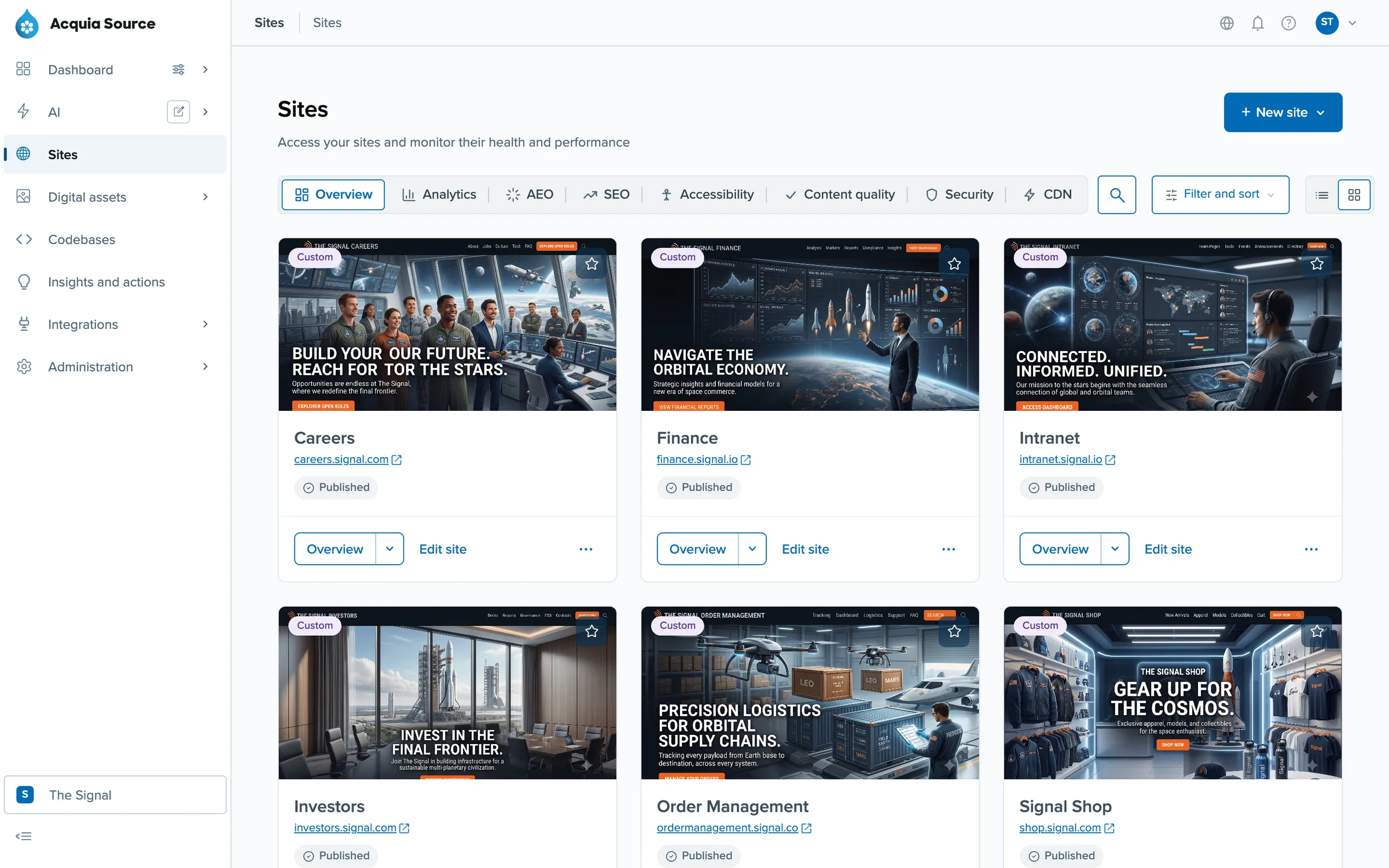
Sites, with filters for analytics, SEO, accessibility and security.
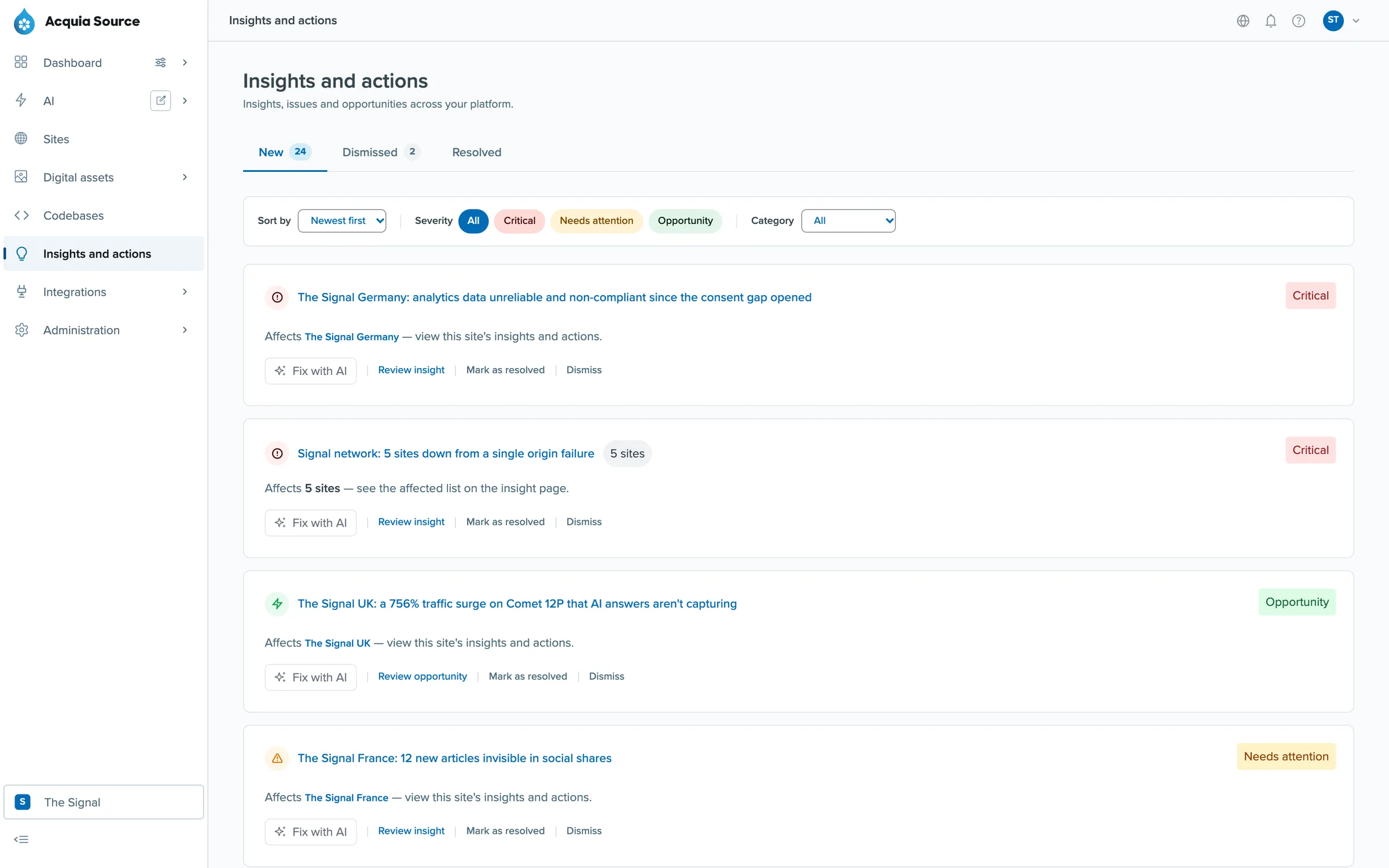
Insights and actions: problems and opportunities across every site, each with a "Fix with AI" option.
Making it safe to contribute
A prototype with one author is easy. Letting designers, engineers and product people add to it, mostly through their own AI coding sessions, without it turning into ten different products took more work.
I wrote the rules down where the tools read them. The repo's instructions tell any AI session how the prototype works before it touches anything. A design rules file covers backgrounds, borders, card anatomy, colour tokens and the type scale. Four custom lint rules check the parts a machine can: buttons, page width, colour tokens and design system components only. Each error names the rule it breaks. The 24 patterns, from tables to destructive actions, give new screens something to copy. Two skills walk an agent through adding a page and checking it against the original.
Then I built designer tools into the prototype. A pill in the corner outlines every component on the page, blue for design system components and orange for anything custom. It opens the source for a component, forces the page into states like empty or no permission, and exports a handoff pack for engineering. The orange outlines make drift obvious to people who don't read code.
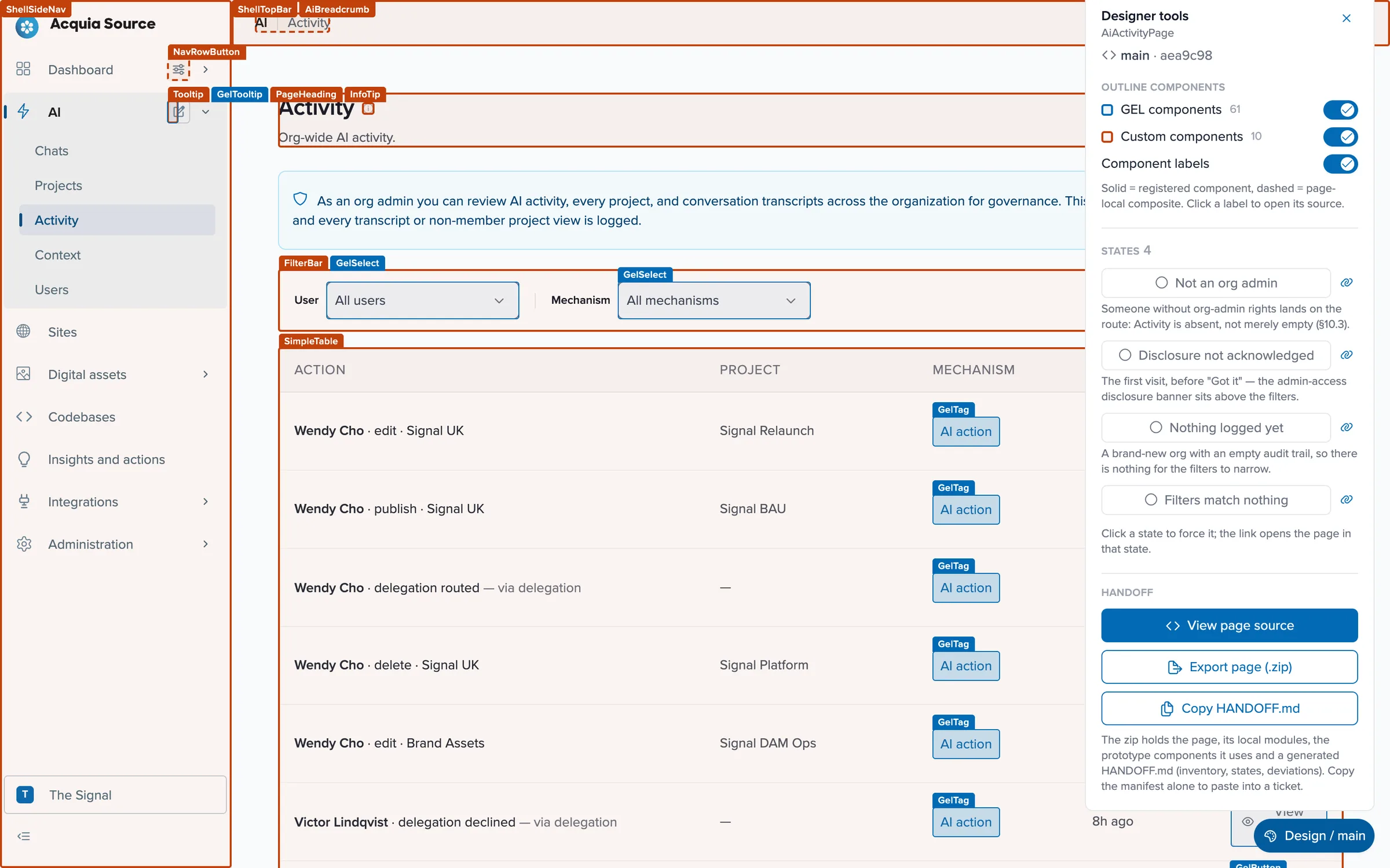
Designer tools on the AI Activity page: every component outlined and labelled, page states to force, and a handoff export.
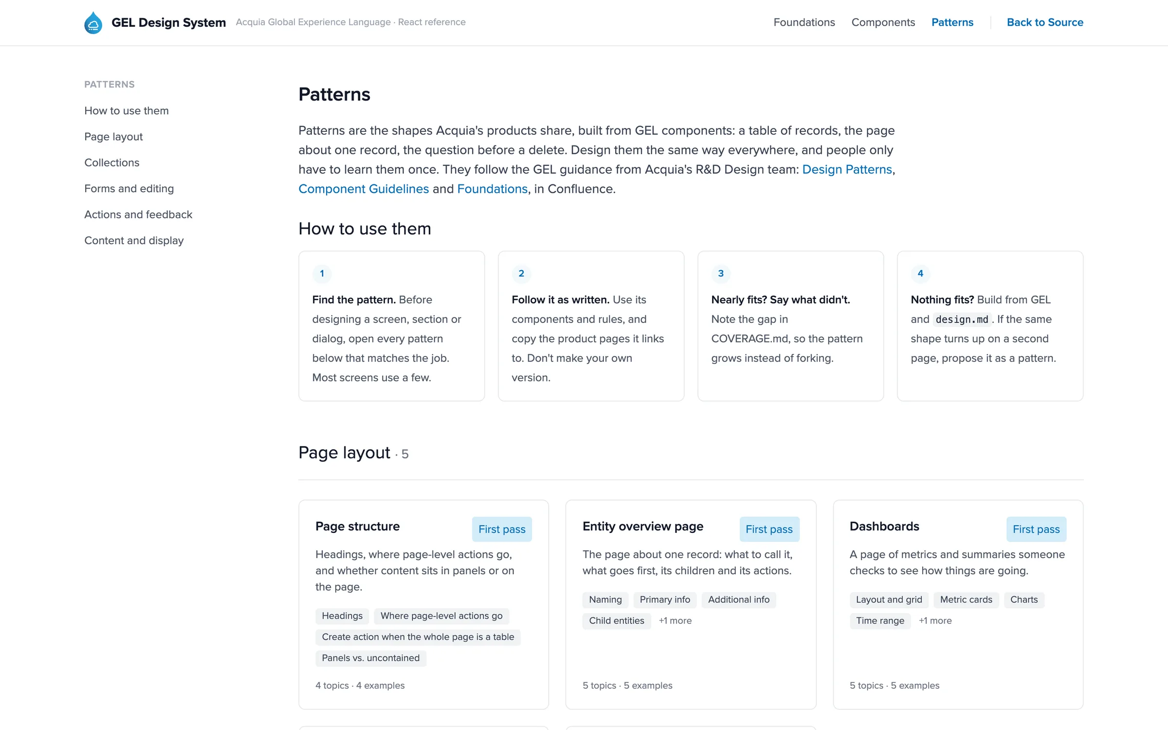
The patterns library, with a reference implementation for each pattern.
Rebuilding it on GEL
The first prototype was built from exported code, which engineering couldn't reuse. So I started rebuilding it on GEL, Acquia's design system, as a second copy that mirrors every route. 35 pages have been rebuilt so far, and the rest fall back to the original until they are. A check that runs in CI and in every Claude Code session makes sure a change to one copy reaches the other.
Each page is logged in a coverage file: what was rebuilt, where it had to deviate, and what GEL was missing. The gaps go back to the GEL team as requests. As an example, the AI Activity page went from 2 design system components and 67 custom ones to 60 and 7.
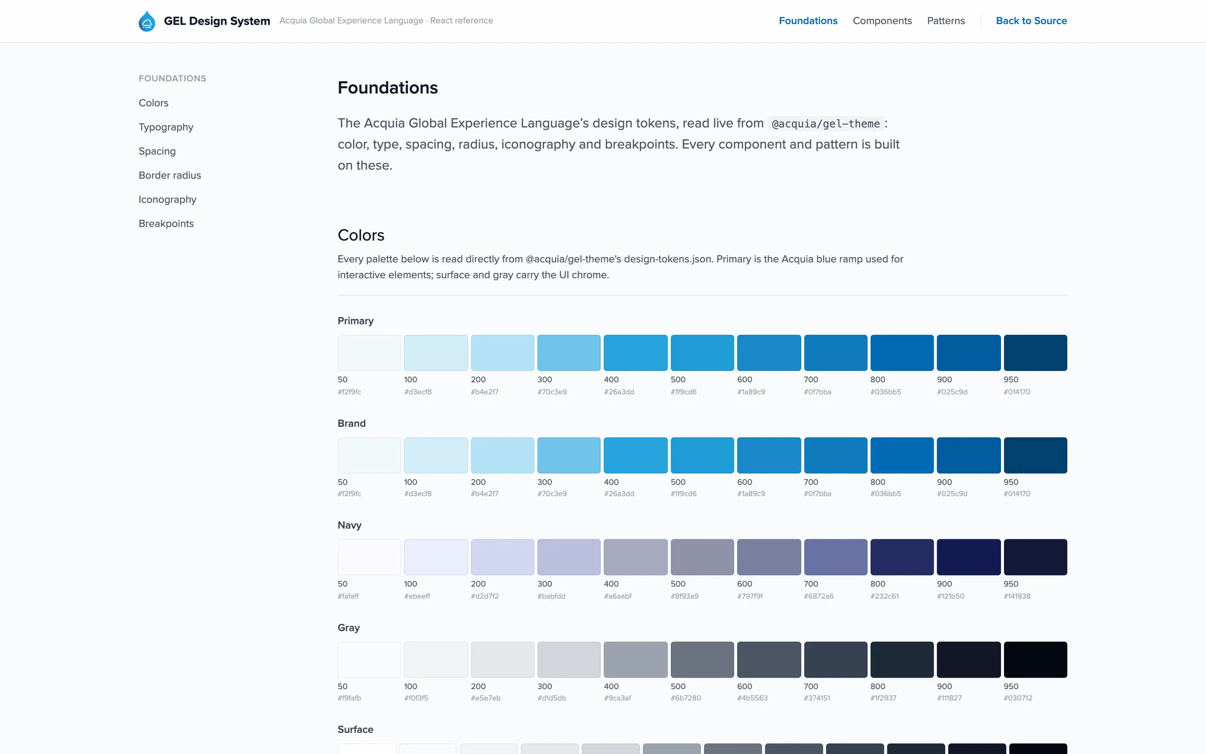
Foundations, read straight from GEL's design tokens.
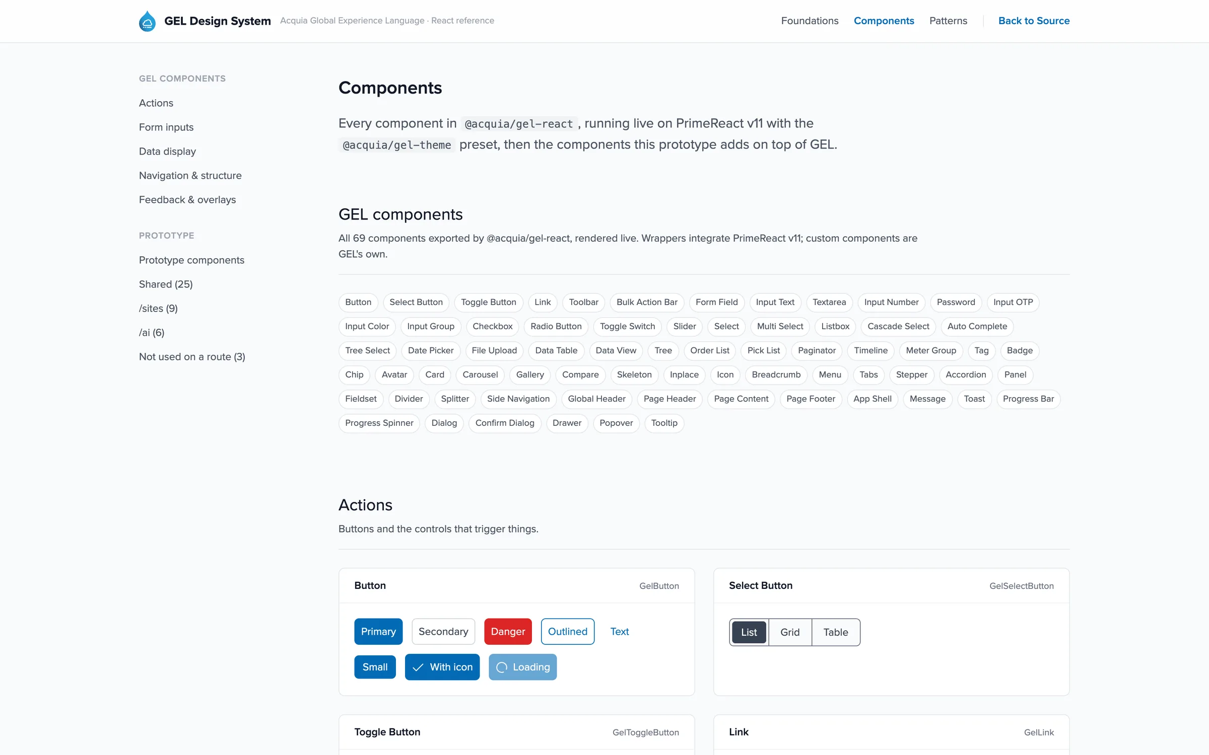
The component catalogue, running on the same code the pages use.
Results
There are no usage numbers to share yet. What's true today:
- Acquia Source is live, including the navigation, the organisation switcher and the AI area. Many of the features I designed were cut for time before release, and the prototype still has the full design.
- One navigation model covers every product area, from dashboards to AI, on desktop, tablet and mobile.
- The prototype has 104 routes, and it's what the product team demos. You can try it yourself.
- Colleagues across design, engineering and product build their own areas in it, and I review and merge their pull requests.
- Engineering has GEL versions of 35 pages to build from, plus a list of what GEL is missing.